Visual Identity
Every project is unique in its purpose, planning and partners, and therefore requires a strong, evocative and memorable visual identity. We start by breaking down the concept of the project to its most basic elements to then build up layers of meaning around the logo for a story to emerge.
The ZERO BRINE project is about recovering the wastewater (known as brine) from industrial production processes to reuse the minerals, salts, water and other components in other industries, thus closing the figurative loop and contributing concretely to the circular economy in Europe.
The Basic Elements
We began looking at design forms that would symbolize and show the circularity and continuity of the ‘closing the loop’ concept. As a point of departure, we looked at the infinity sign for inspiration: known as lemniscate in Greek, lemniscus means “ribbon” or “band”.
When giving the lemniscus a third dimension, we discovered the famous Mobius Strip that is created by taking a strip of paper, giving it a half-twist and then joining the ends to form a loop. Embedded in a three-dimensional Euclidean space, the Mobius strip inspired M.C. Escher in the geometric design of his impossible circular staircases, known as the Penrose stairs.
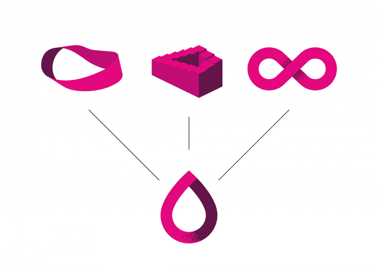
We derived the feeling of strength, continuity and circularity from these forms to create the half figure eight with an overlapping ribbon in the middle, implying a work in progress to advance ‘closing the loop’.
As the icon of the ZERO BRINE project emerged, we looked more closely at the recuperated elements from the brine – that salty wastewater sludge containing sodium chloride, magnesium, nitrates and other minerals and chemicals compounds that can be used in other industries.
The crystals served as inspiration for filling the ZERO BRINE icon ribbon with the project colors to represent the two-stage process of (1) creating clean water from desalination (blue) to (2) recuperating the leftover brine waste (purple). The crystals connect this double process inherent in ZERO BRINE.
To match the centrality of the salty crystals in the ZERO BRINE project, we chose a typographic font that would be easily recognizable with the slight curl to the ‘R’ that echoes the feeling of re-starting the circular process. The Program font is also easily applicable for usage as it is very near to Calibri.
In deconstructing the basic elements of the project to reconstruct a solid ZERO BRINE logotype, we explored different slogans that would evoke an emotional connection to ‘closing the loop’ and thus contribute to advancing the circular economy in Europe and its economic competitiveness globally.